Identity
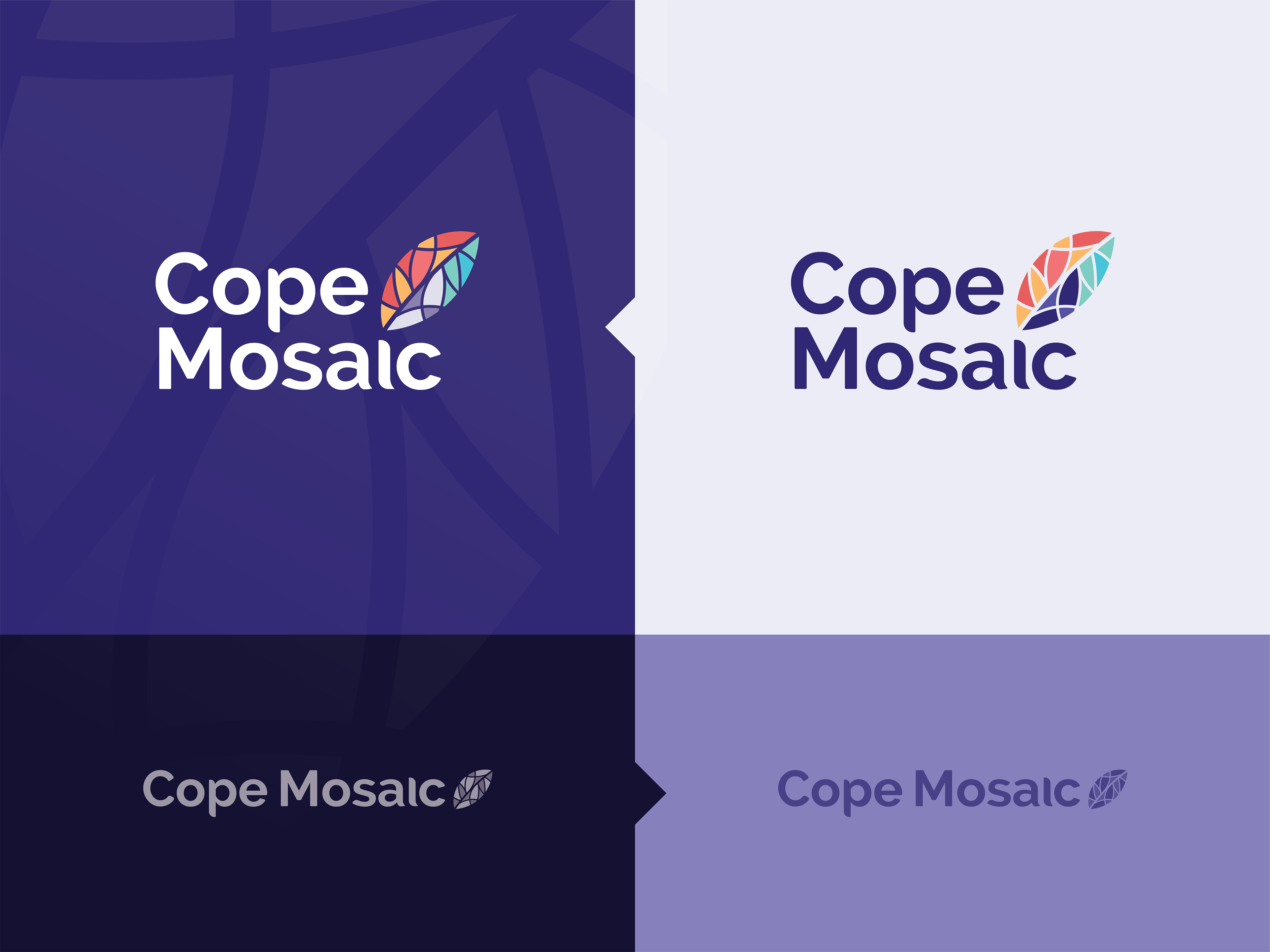
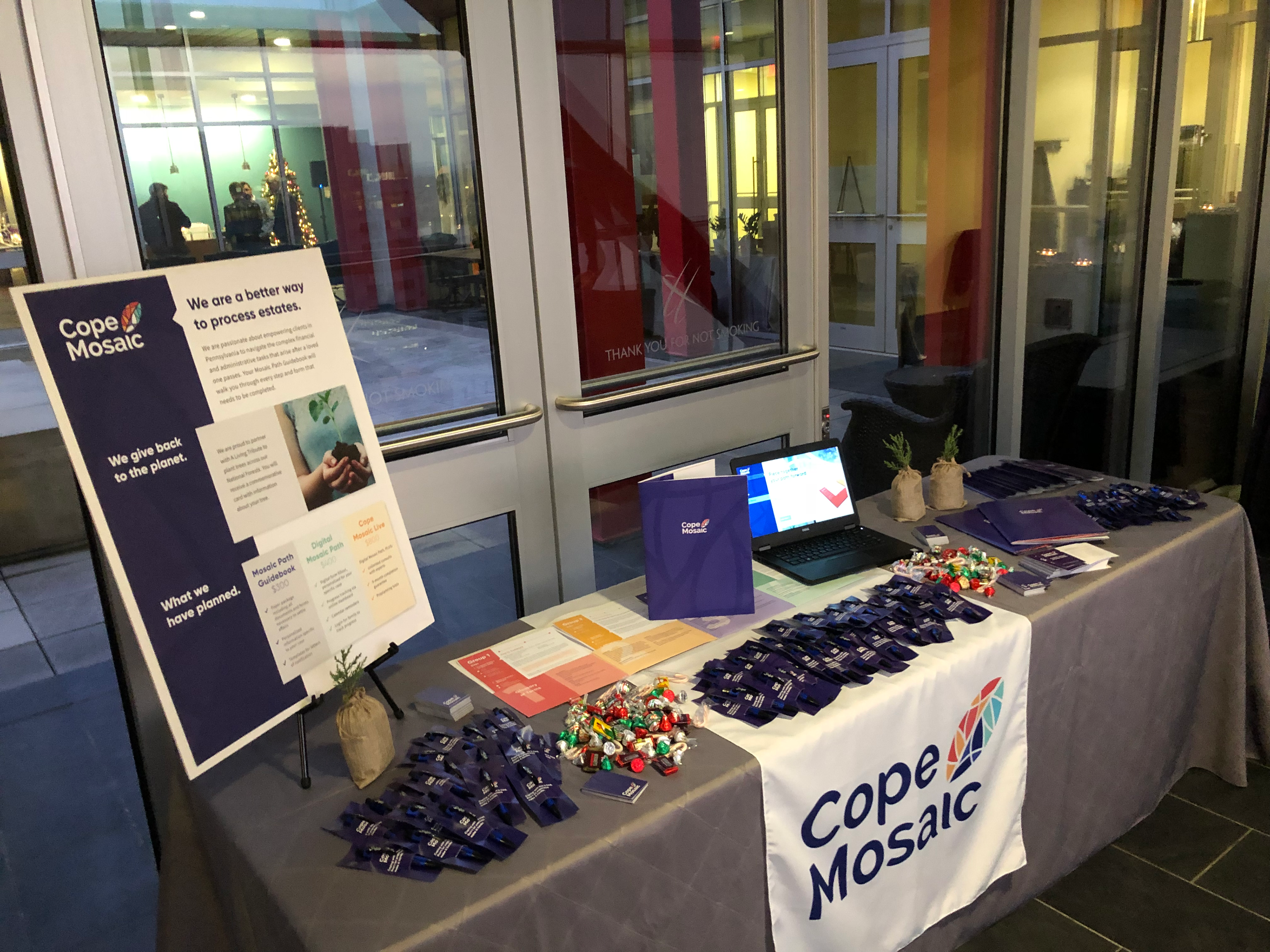
After defining the new voice of the brand, we constructed a new logo, with friendly lines and curves, and a mosaic leaf to signify piecing together a life after losing a loved one, and the growth that comes from being able to properly grieve. The branding was then applied to advertising and social media to refresh the public face of the company.


Website
The website was designed with large interactive elements to keep ease of use for older audiences in mind. It was also designed with extensibility and scalability as primary drivers, since a digital product and service line are the next steps of the business roadmap. It will be easy to apply these extensible styles to a larger line of interactive dashboards.
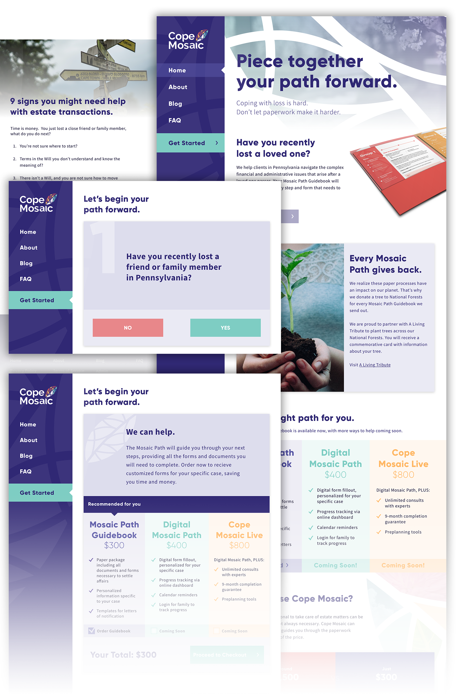
At launch, the website checks if potential customers can benefit from Cope Mosaic's product offerings by asking up to four questions in a survey. The user is then guided to the appropriate solution, with most cases requiring the Mosaic Path Guidebook. The guidebook walks an executor/executrix through every step of the estate settlement process, and includes personalized information.
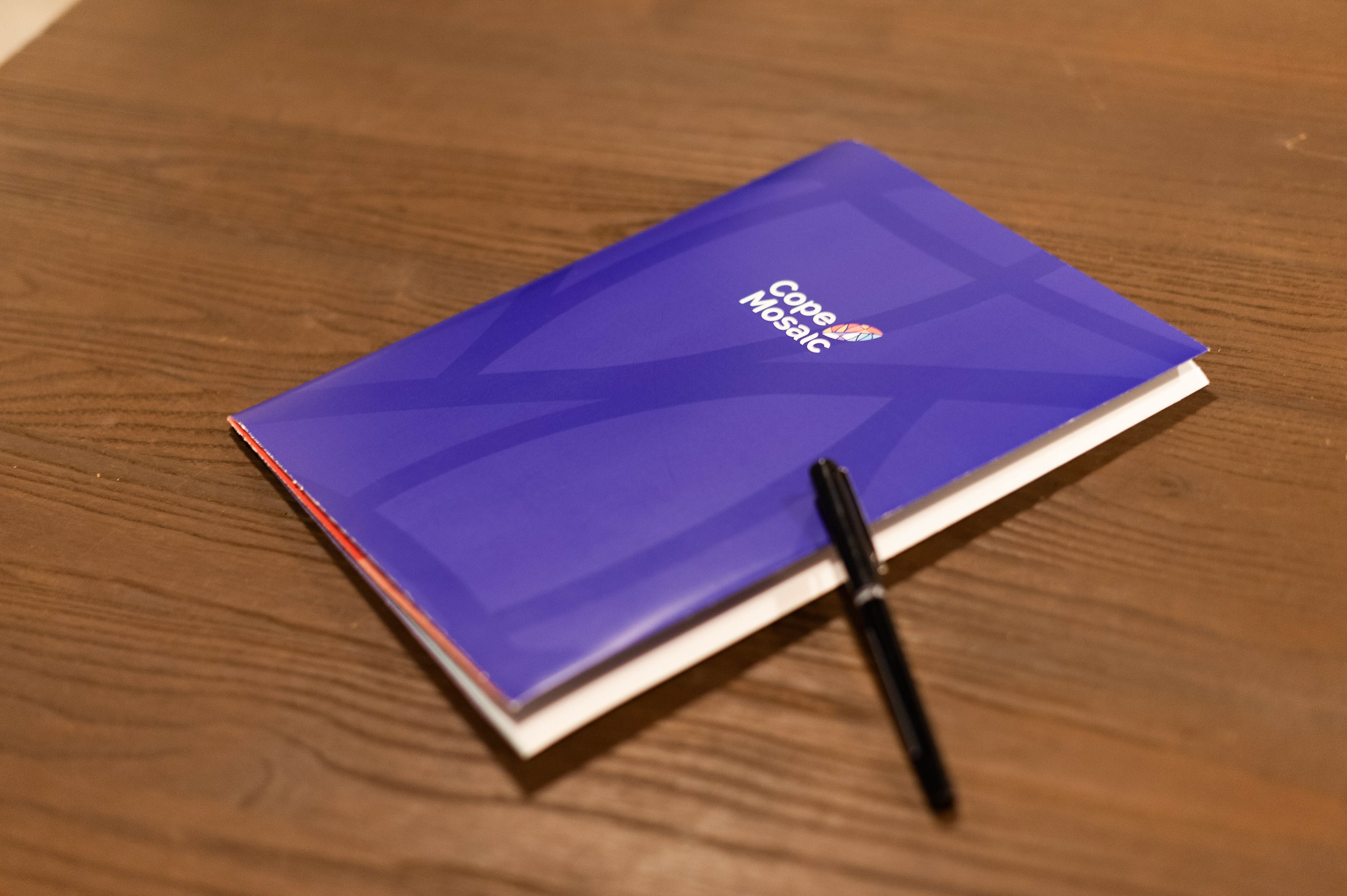
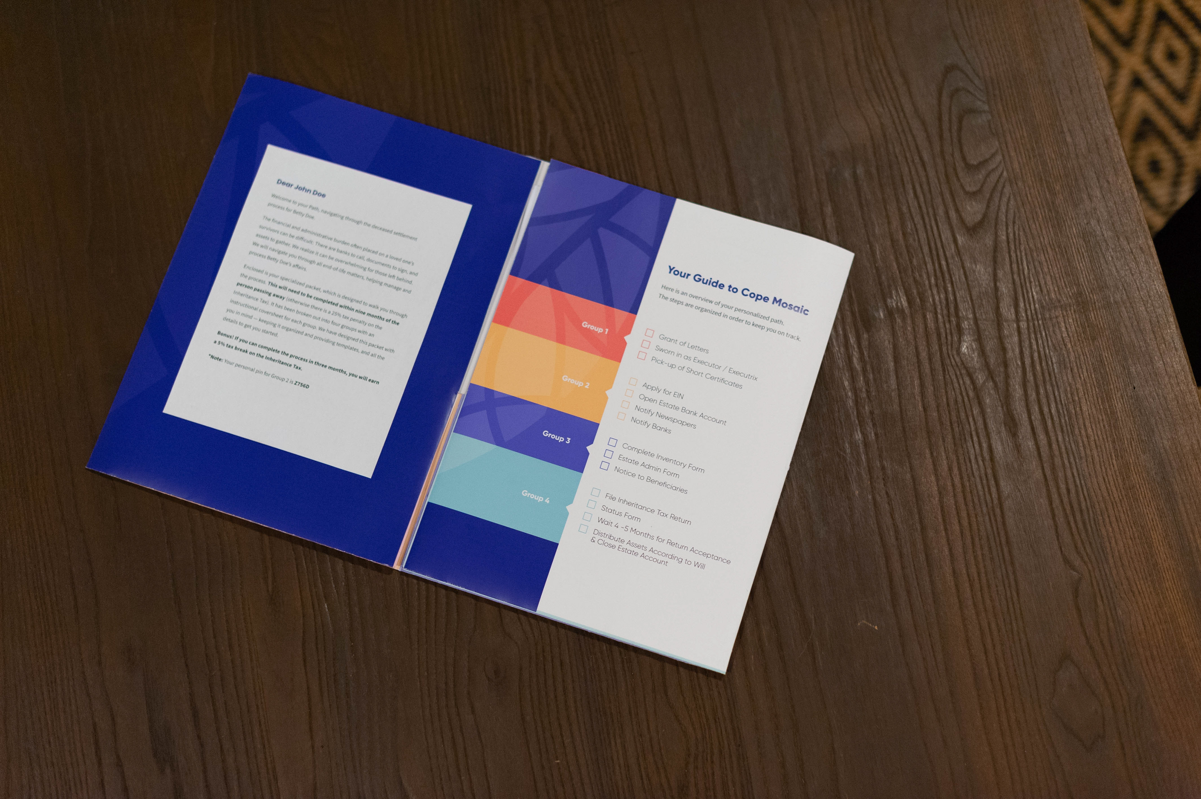
Physical Product
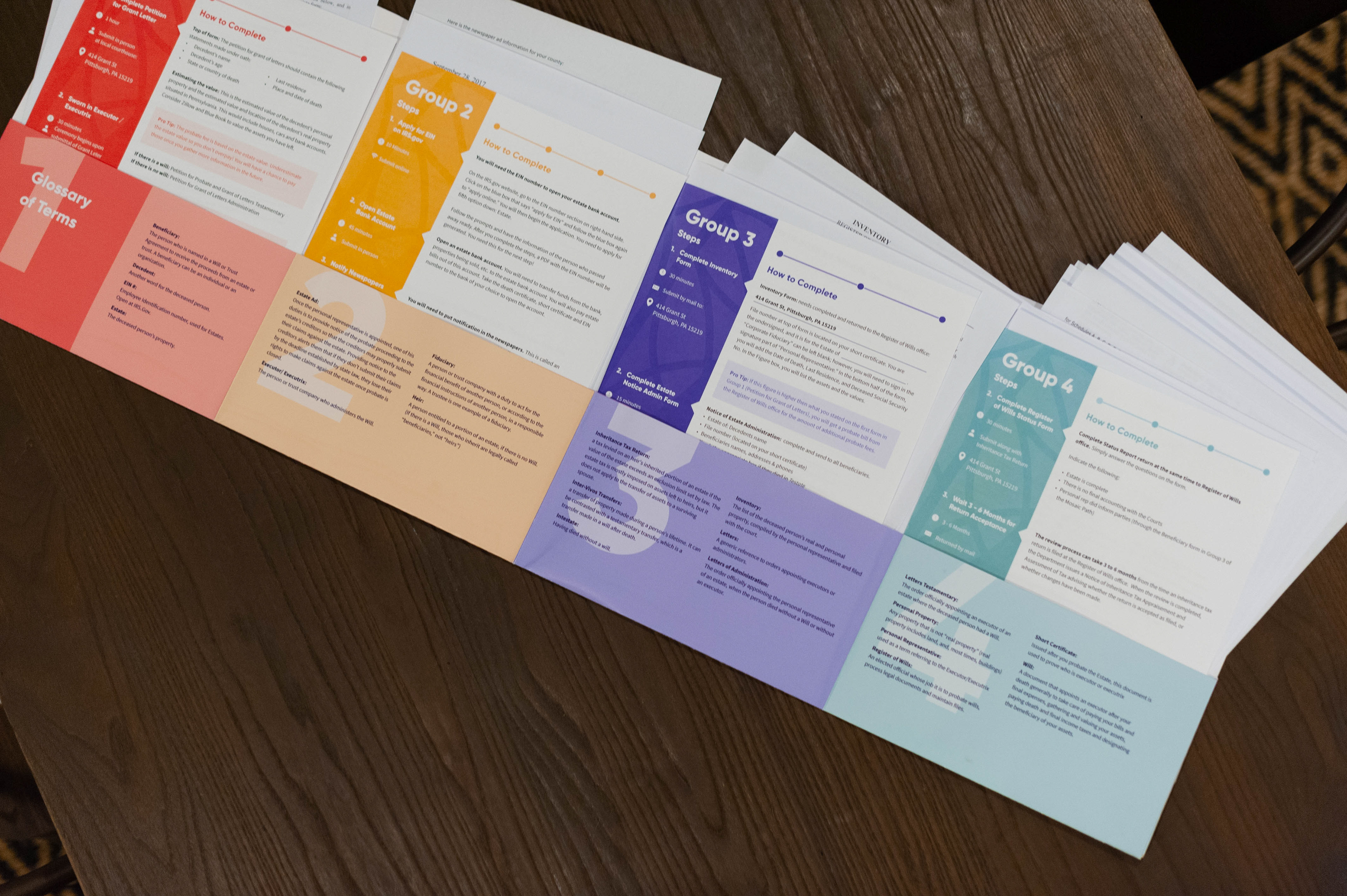
The design challenge was to include over 20 papers and forms in a package that would not overwhelm and would keep the customer on track. Minimizing confusion meant color coding the instruction sheets to the folder pockets, and streamlining steps by visually indicating requirements, locations, and timeframes.
The project culminated with Demo Day, a chance for the founder to introduce her new brand and product to the public.