This project was a customer-focused rethink of the PA Turnpike Website experience. Care was taken to put customer needs right up front, in an effort to make traveling on the turnpike as effortless as possible.
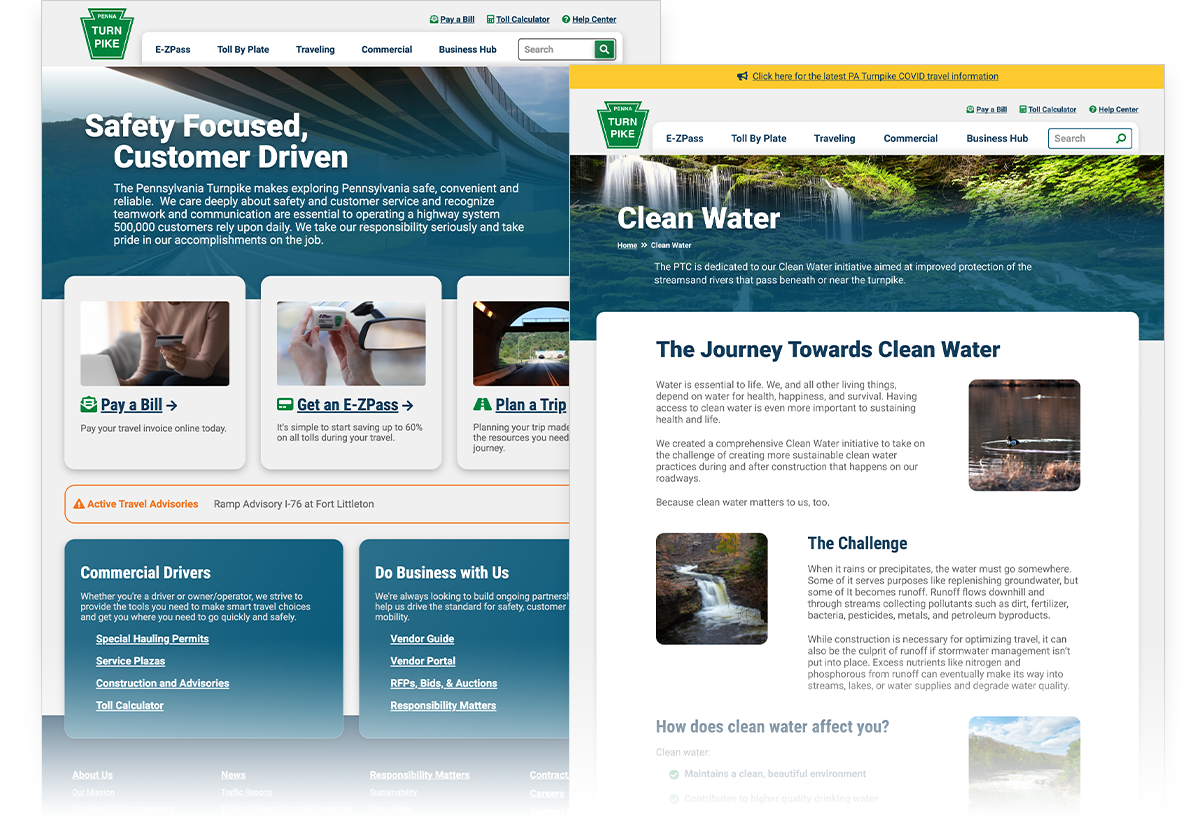
Our team focused on modernizing the experience of trip planning, with a special emphasis on saving travelers money by recommending a switch to E-ZPass. We implemented map interfaces to visually organize information for the traveler. They can find out where to buy an E-ZPass, where major construction might impact their trip, how much their trip will cost, and where to stop for lunch along the way. These new experiences will elevate their journeys and ease their travels.
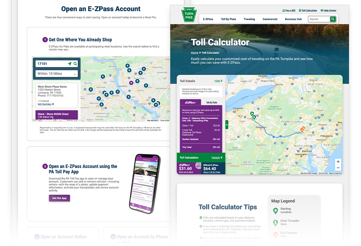
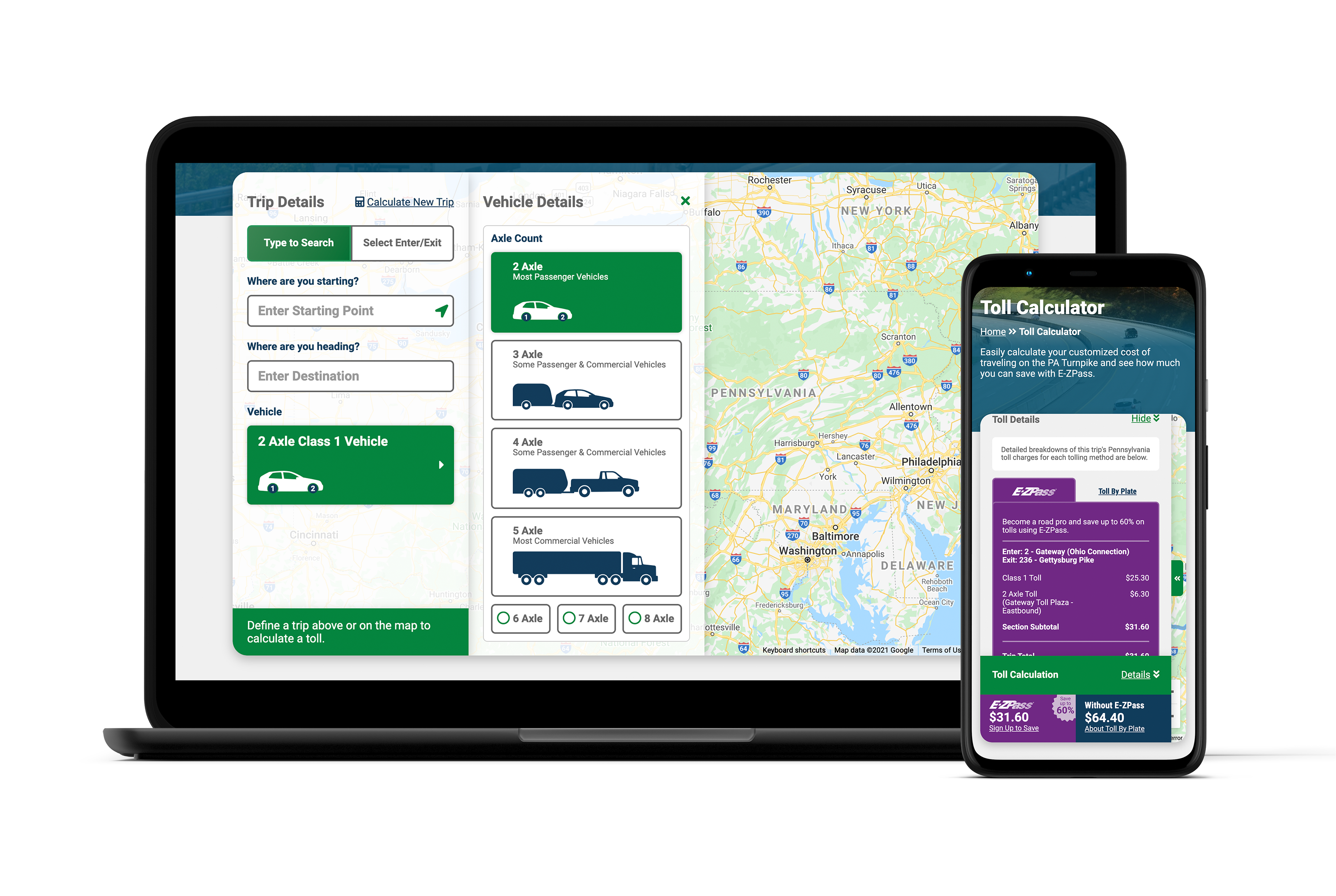
A large portion of my own design effort was spent on making the toll calculator a best-in-class experience. Travelers previously had to know exactly where to enter and exit the turnpike, and the names of those interchanges. They also had to navigate confusing industry jargon to confirm the amount they would owe.
After strategy and research into the problem, we iterated and tested several prototypes and integrated user feedback into the final product. Now customers have the option to search their beginning and end points as they would on Google Maps, and their toll is calculated. Warnings appear if their selected vehicle may have restrictions on their route, and messaging is present to inform the user of any special toll cases. Additionally, the traveler will be able to see side-by-side just how much money they could save by getting an E-ZPass, aligning with our goal to increase conversion.
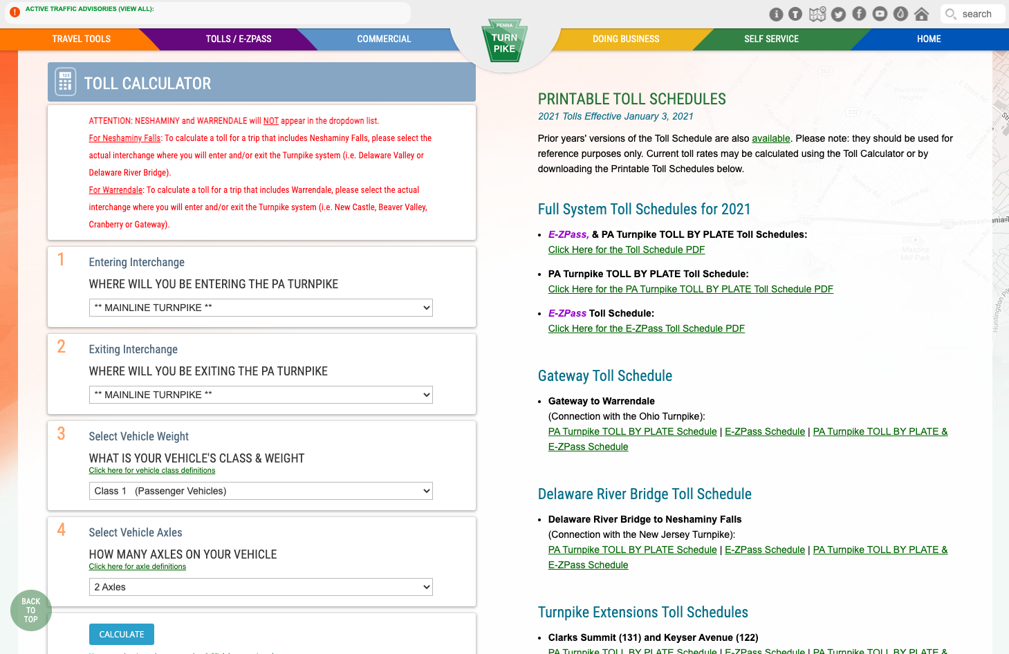
The former toll calculator experience
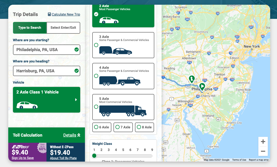
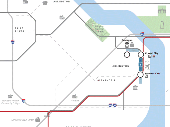
The new experience, showing semantic route calculation and visual vehicle selection
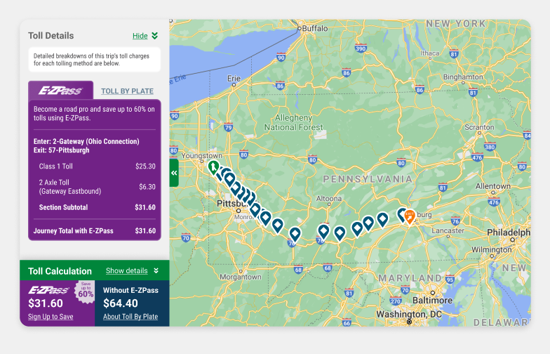
If they pass through multiple toll points, users can see a line by line breakdown of where and how much they are tolled.
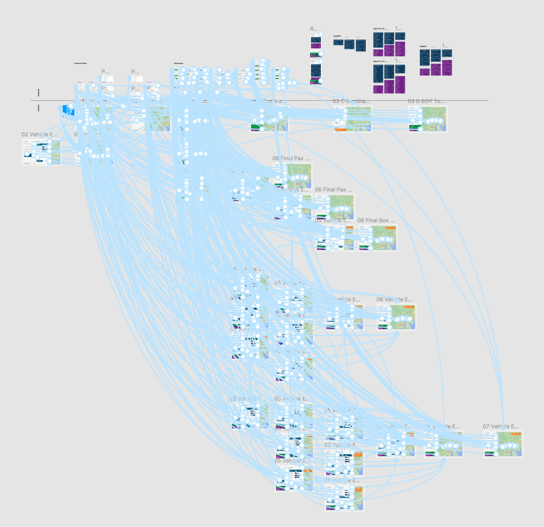
One of the iterative prototypes developed in Figma, showing the many connections and interactions that we made for user testing.
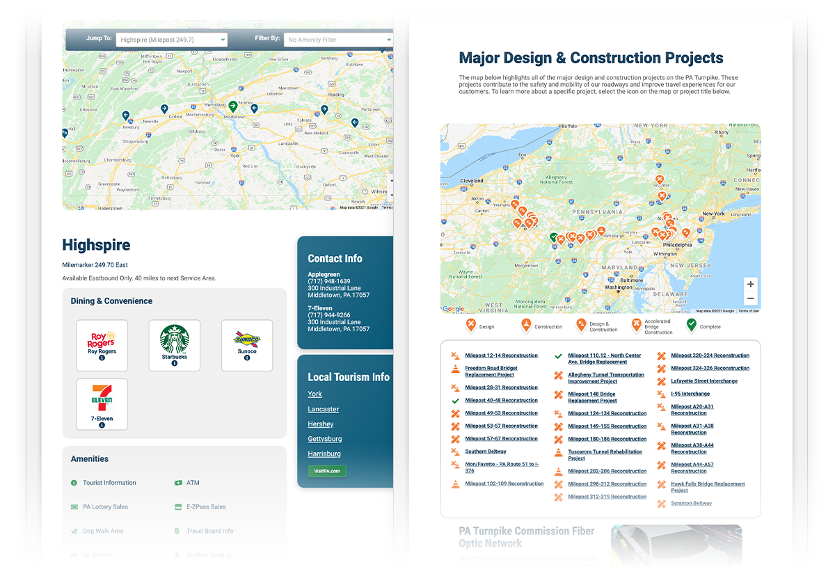
A brand new Service Plaza experience came to life as well. Previously, the team expressed concern about keeping all the information about vendors and amenities up to date. Now, a streamlined backend gives them confidence that users can find exactly what they need for their trip. Travelers can filter by specific dining, fueling, or rest stop options and plan ahead to stop where the services best fit their needs.